Overview
I participated in a week-long innovation sprint to research, ideate, design, and develop a working feature, which was then tested in a live production environment. Our goal was to improve how users report technical issues on our site. Testing revealed that desktop users struggled to discover the feature, leading us to rethink its implementation. However, we gained valuable insights into how new users navigate our site, which will inform future improvements.
The Challenge
Users experiencing technical issues didn’t know where to report them. The “Contact Us” link was hard to find and lacked clear instructions for submitting technical issues. Additionally, users had to describe issues manually, which made triaging difficult.
Our goal was to create a persistent, easy-to-access reporting feature that allowed users to attach screenshots or highlight issues directly on the site.
Sprint Breakdown
The five-day sprint followed a structured approach:
Day 1: Define the problem, research existing solutions, and establish success metrics.
Day 2: Create wireframes, develop a proof of concept, and recruit test users.
Day 3: Build the prototype, refine user flows, and set up metrics.
Day 4: Finalize development, conduct internal testing, and refine the feature.
Day 5: Test with real users and analyze results.
Ideation & Defining Success
We started by breaking down the problem into key goals, metrics, and risks:
Objective: Make reporting an issue quick and intuitive.
Success Metric: Users can easily find and use the reporting feature.
We researched industry best practices and identified a common pattern: a persistent “Report an Issue” button available on every page. This would allow us to continue running targeted surveys while giving users a way to report issues at any time.
Miro board capture of research
Design & Prototyping
Using low-fidelity wireframes, we explored placement options for the “Report an Issue” button. During this process, we also identified improvements for the existing “Contact Us” link, which we saved for future implementation.
A key challenge was guiding users through capturing screenshots without disrupting their experience. We considered pop-ups versus side panels and prioritized a mobile-friendly design, given a significant portion of our users access the site via mobile.
Our final concept:
A right-side tab that opens a side panel for issue reporting.
A guided flow for submitting issues and attaching screenshots.
A modified mobile experience without screen capture, allowing users to upload existing images instead.
Mid-fidelity mockups were created to guide engineering in building the prototype.
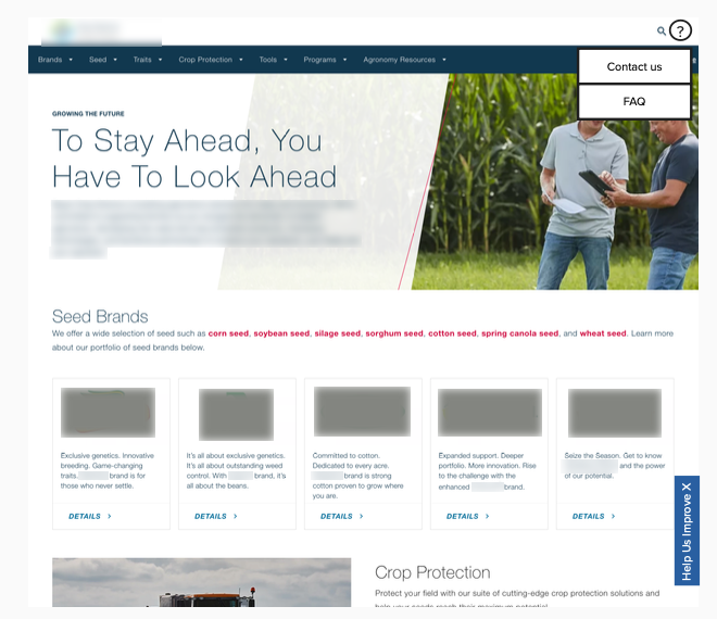
Contact us alternative placement and Help Us Improve flag placement.
Sidesheet Concept
Testing & User Journey Mapping
While the engineering team built the proof of concept, we mapped out the post-submission process:
How issues would be logged, categorized, and assigned to teams.
What systems needed to be in place for tracking and resolving reported issues.
We recruited four test users:
2 project managers (to test desktop)
1 UX researcher (to test mobile)
1 customer service rep (to test both)
I developed a usability testing script to ensure consistency in feedback collection.
Prototype Testing & Results
Within 1.5 days, the engineering team had a working prototype. Due to technical challenges, screen capture was limited to desktop, while mobile users could only upload existing screenshots.
After internal refinements, we deployed the feature to production under a feature flag, allowing real-time testing with live data.
Key Findings
Desktop users struggled to find the reporting tab.
Mobile users discovered and used the feature more easily.
These insights showed that discoverability needed improvement, leading us to rethink the design for desktop users while leveraging navigation patterns we observed for future iterations.
Next Steps
While our initial solution had usability gaps, the sprint provided valuable insights into how unfamiliar users navigate our site. This will directly inform the next iteration of the reporting feature, making it more intuitive and effective.


